Flow of Ice Across Antarctica
 |  |
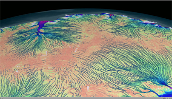
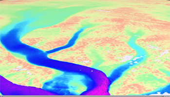
These animations show the motion of ice in Antarctica as measured by satellite data from the Canadian Space Agency, the Japanese Space Agency and the European Space Agency, and processed by NASA-funded research from the University of California, Irvine. The background image from the Landsat satellite is progressively replaced by a map of ice velocity, which is color-coded on a logarithmic scale. The colors represent the speed of the ice flows in meters per year, with areas in reds and purples flowing the fastest. The values vary from 39 inches (1 meter) per year (brown to green) to 1.86 miles (3,000 meters) per year (green to blue and red).
These animations do not show where ice is melting, but how ice is naturally transported from the interior regions, where it accumulates from snowfall, to the coastal regions where it is discharged into the ocean as tabular icebergs and ice-shelf melt water. For the purpose of the animation, hundreds to thousands of years of motion are represented on much shorter timescales.
This pattern of motion has never been observed on this scale before. These observations have vast implications for understanding the flow of ice sheets, and how they might respond to climate change in the future and contribute to sea-level change.
The Landsat satellite program is a joint effort between NASA and the U.S. Geological Survey.
