


Classroom Activity
Making Topographic Maps

Overview
Students analyze and interpret topographic contour maps to describe their three-dimensional structure while learning about technology used to map the seafloor, Earth's surface, and other worlds. Through understanding geographic structures, students will also be able to identify the best technology used to map these structures.
Materials
Management
While students can work in small groups, consider providing a data sheet to each student to encourage discussion and comparison of their maps.
Background
You have undoubtedly seen maps online or in classrooms, sometimes in the form of a globe or paper atlas. You may have also noticed that the level of detail changes with scale. For example, a map of California, whether zoomed in on a computer or on a paper map, may have more information about roads, cities, and structures that are not shown in a map of the entire Earth.
Depending on where you saw this map, you very likely saw different types of features identified – such as land, water, snow, and forests. Scientists in numerous fields – from geography to geology to oceanography – all use maps in different ways, choosing to represent the information most relevant to their field of study. Geologists exploring the land may use colors to indicate the age or structure of rocks, while oceanographers exploring the sea may use contour lines to show the depth of features below the water.
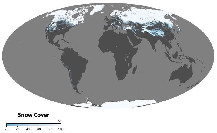
This map created with data from NASA's Terra satellite shows snow cover across the globe in May 2022. Image credit: NASA | › Full image and caption | + Expand image
One such feature that is important to capture in creating maps is topography, or the physical height and depth of the Earth. Topography – or "bathymetry" when referring to mapping underwater – describes not just where we find features like mountains and valleys, but also the size, shape, and steepness of the surface.
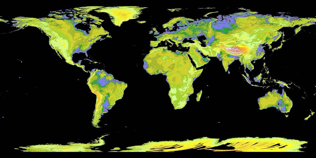
This topographic map called a global digital elevation model uses colors to denote elevations. Low elevations are purple, medium elevations are greens and yellows, and high elevations are orange, red, and white. Image credit: NASA/GSFC/METI/ERSDAC/JAROS, and U.S./Japan ASTER Science Team | › Full image and caption | + Expand image
While mapping is still done by scientists in the field, many disciplines are now using technology and instruments developed by engineers to map larger areas more efficiently. Let's review some of the mapping technology used today for scientific mapping along with its benefits and drawbacks.
Sonar

The first of these two animations shows an example of how sonar is used aboard ships to map the sea floor. Image credit: NASA/JPL-Caltech | › Full image and caption | + Expand image
Oceanographers use sonar, which stands for sound navigation and ranging, to send pulses of sound waves from underneath a ship to the sea surface below. Sonar works by measuring the time it takes for sound waves, or the "ping", to reflect off the seafloor and return to the ship. While sonar allows for incredibly high-resolution maps, it can be a time-intensive process, requiring a vessel to sail back and forth, collecting strips of data, or "swaths", that together provide a map of the larger area.
Lidar
The CALIPSO satellite uses lidar to monitor clouds and aerosols across Earth. Image credit: NASA/CNES | › Full image and caption | + Expand image
In some environments, it's possible to instead use lidar, or light detection and ranging. Employed by NASA instruments such as HALO to study clouds and aerosols above the ocean surface, lidar uses a green-light laser rather than sound waves and is typically mounted to an aircraft or satellite. Like sound waves, the green light has a known speed as it travels from the air to the ground below, meaning the distance to the ground can be measured. Lidar works well for solid land and shallow water but cannot be used for deep water. That’s because light refracts and loses intensity as it moves through water, so if the water is too deep, the green-light laser can’t reach the bottom and bounce back to the detector.
Radar

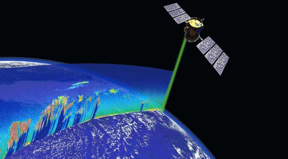
Using advanced radar technology, as shown in this simulated view, the NISAR satellite will be able to track minute changes in Earth's surface. Image credit: NASA/JPL-Caltech | + Expand image
For coastal areas and dry land, the most common mapping technique is radar altimetry. Much like lidar, radar sends a light-wave signal to the ground, but instead of visible light, the signal is made up of radio waves.
The NISAR mission will use radar to take complete scans of Earth every 12 days at a level of detail never before achieved in Earth science. A collaboration between NASA and the Indian Space Agency, the mission is designed to track changes to the surface of our planet. Using a technique called synthetic aperture radar, or SAR, NISAR will construct maps from space at a scale of just centimeters per pixel. These maps will be so detailed and be collected so often that scientists will be able to track even the most minute changes in topography over time. By monitoring these changes, we could learn more about the warning signs of droughts, volcanic eruptions, and more.
Learn more about how the NISAR mission will track Earth's changing surface like never before. | Watch on YouTube
Radar used on satellites like NISAR as well as sonar, and lidar, provide data about Earth's surface. However, scientists often need to translate that data so that it can be more easily understood by a variety of people. One way they do that is by creating a contour map.
Contour maps use contour lines to show elevation (or depth) with each line representing a change in height. If there are very few lines and they are widely spread apart, this signifies that the area is mostly flat. However, if the lines are tightly grouped, this indicates that the elevation is changing quickly and the area is very steep. However, note that since geographic features such as mountains are rarely symmetrical, one side may have spread out lines (a gentle incline) while another side has many close lines (a steep cliff).
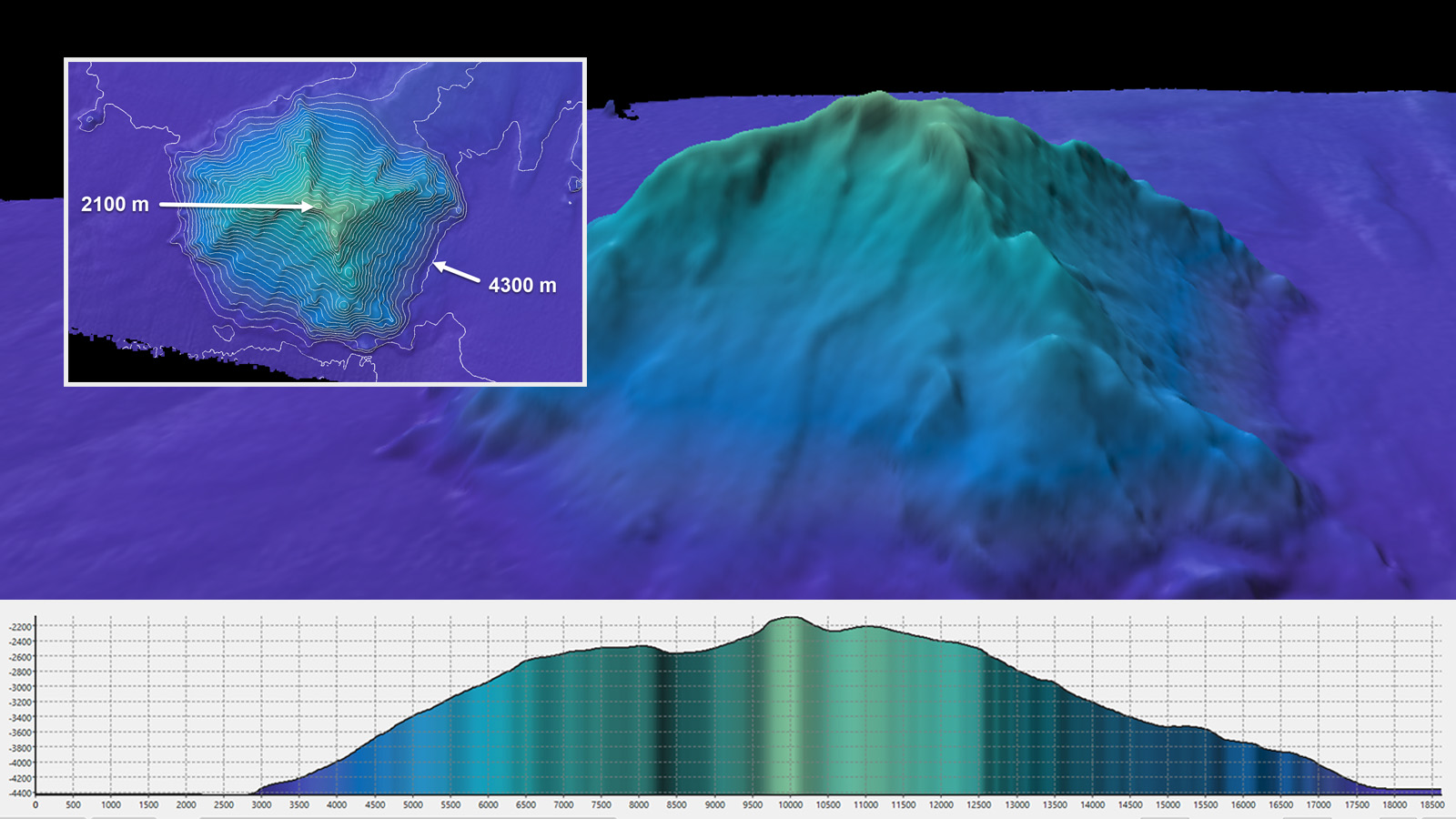
A seamount captured using sonar aboard the exploration vessel Nautilus is shown in three different topographic views. The background image is a 3D elevation profile. The inset is a top-down view with contour lines, similar to the ones students will be using in this lesson. And the graph on the bottom is a 2D elevation profile like the ones students will create. Image credit: Ocean Exploration Trust | + Expand image
Understanding this topography guides everyone from geologists to hikers in navigating the terrain while also helping NASA researchers track floods, landslides, and more as Earth's surface continually changes in small but significant ways.
Procedures
- Ask students how maps communicate different features of the terrain. Consider showing some examples of maps that pertain to your local geography and course content. How do we distinguish land from water and mountains from valleys? What about surface structures like forests and deserts?
- Explain to students that details such as color (heat maps) and texture (contour maps) can be added to maps to help convey topography, the physical features of Earth, as well as bathymetry, the underwater surface structures hidden from the naked eye. NASA scientists use topographic maps to better understand features on Earth, our Moon, and many celestial bodies in our solar system. While heat maps and contour maps provide a lot of information at a glance, it's important to understand how color or contour lines convey characteristics such as height, steepness, and depth.
In the case of Saturn's moon Titan, radar is key to understanding the surface, which is masked by a thick atmospheric haze that makes the topography impossible to see with the naked eye. Scientists used radar data from NASA's Cassini mission, which spent more than 13 years exploring Saturn and its moons, to create this contour map of Titan's surface. Image credit: NASA/JPL-Caltech/ASI/JHUAPL/Cornell/Weizmann | › Full image and caption | + Expand image
- Explain to students that scientists and engineers use different kinds of technology to gather topographic data. By sending light or sound waves from satellites, ships, or spacecraft to the surface below and measuring the time they take to bounce back, researchers can construct various profiles, or views of the surface.
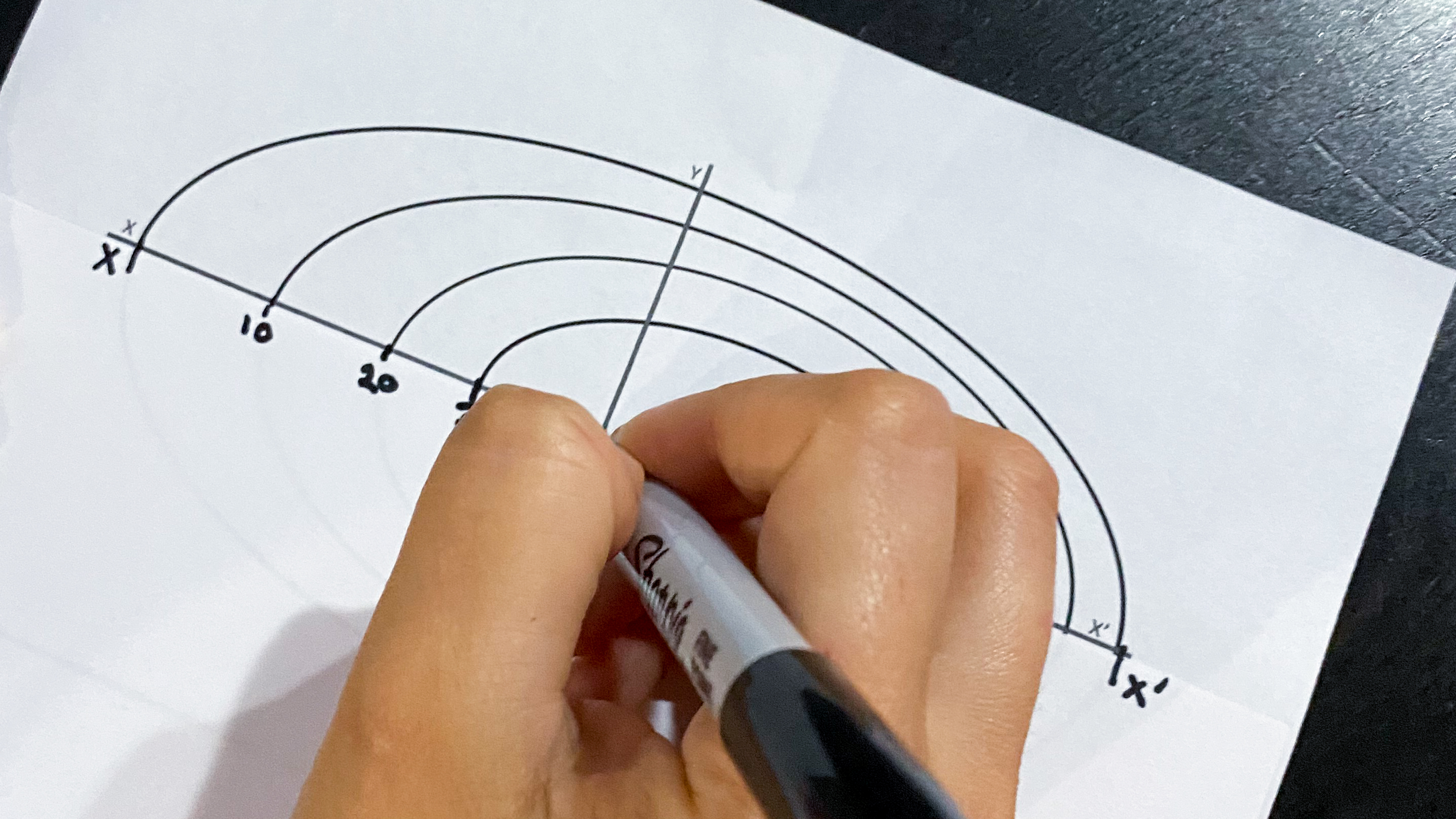
Consider demonstrating this for students by bouncing a ball on the ground from the same height. If you placed a stack of books on the ground, how would that change the amount of time it took for the ball to return to your hand? What if you bounced the ball on a desk from the same height? - Show students their data sheets and tell them they are going to translate contour maps to elevation profiles, or two-dimensional views of the feature from the ground. On their data sheets, a contour map is provided with two cross sections: X-X’ and Y-Y’. These are paths we’ll use to create our elevation profiles, as if we were walking from one end to the other. Each of these will provide the data they need to make an elevation profile of each feature.
- Explain to students that contour maps use contour lines to differentiate areas of changing elevation as they would be seen from an aerial view. Each curved contour line on the map illustrates where the elevation changes; areas between lines are flat, and when a line is crossed, the elevation is changing. Each map has a specified elevation interval displayed in the legend, so that geographers can interpret the steepness of a feature by how close or far apart the lines are. Have students predict what the lines would look like for a steep angle (very tight lines, indicating a quick change in height) versus a flat surface (widely spaced lines).
- Have students begin translating their contour maps by taking a spare sheet of paper and lining it up with the X-X’ cross section points on their first contour map. They should make a mark on their paper at every contour line they see and label it with the appropriate height.
Step 6. Image credit: NASA/JPL-Caltech | + Expand image
- Now have students line up their sheet of paper with the blank X-X’ cross section provided. This is where they will take their top-down view to a two-dimensional view from the ground. The length of the contour map and the profile map are the same and have intervals provided. Students should place data points in the X-Y coordinates that match those of the contour map by sliding their sheet of paper up and marking where each point crosses.
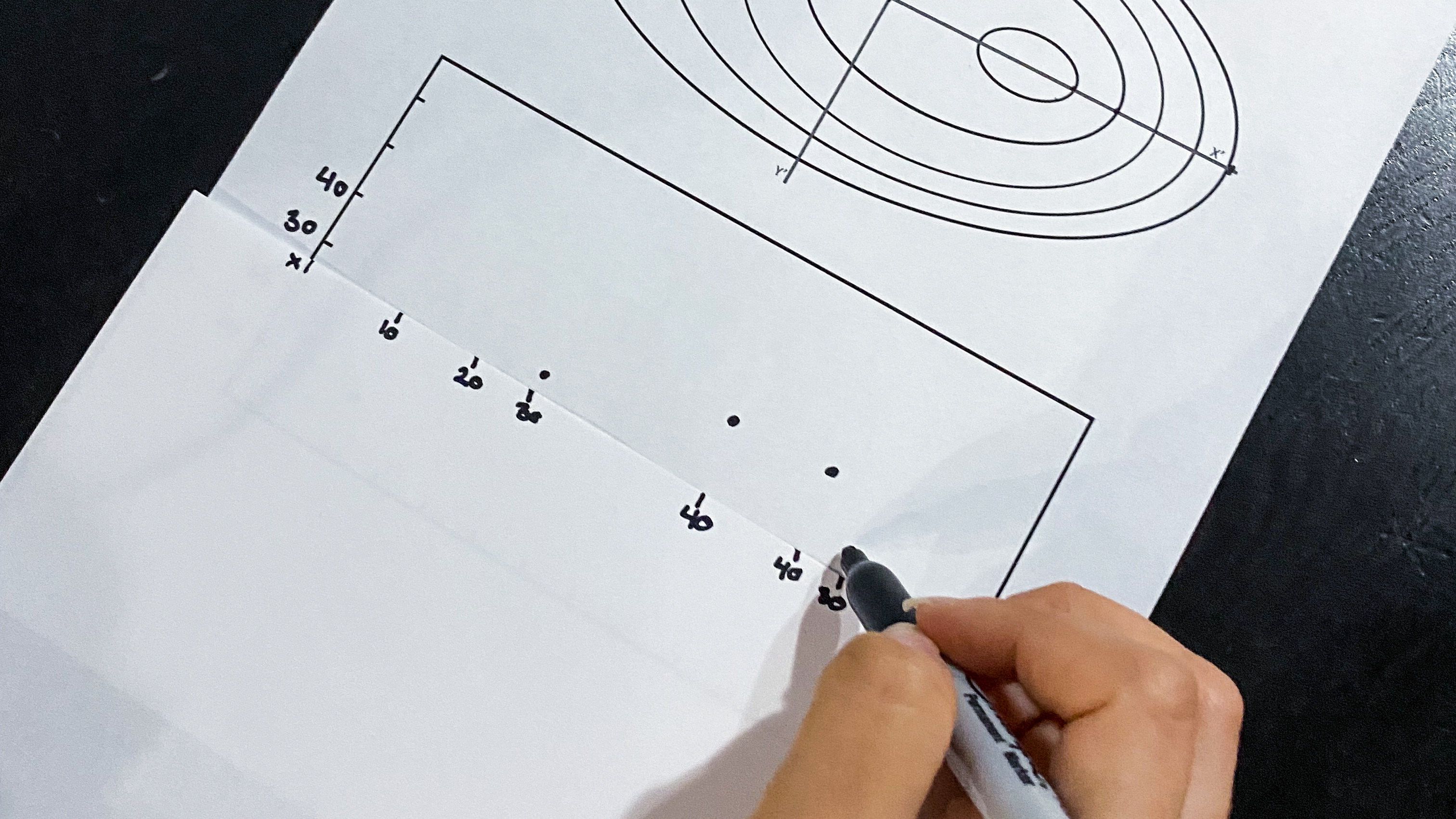
Step 7. Image credit: NASA/JPL-Caltech | + Expand image
- With each point plotted, have students connect their dots. The coordinates now provide a picture of the height of the features versus the distance across. This will illustrate whether the feature is steep, shallow, or even asymmetrical.
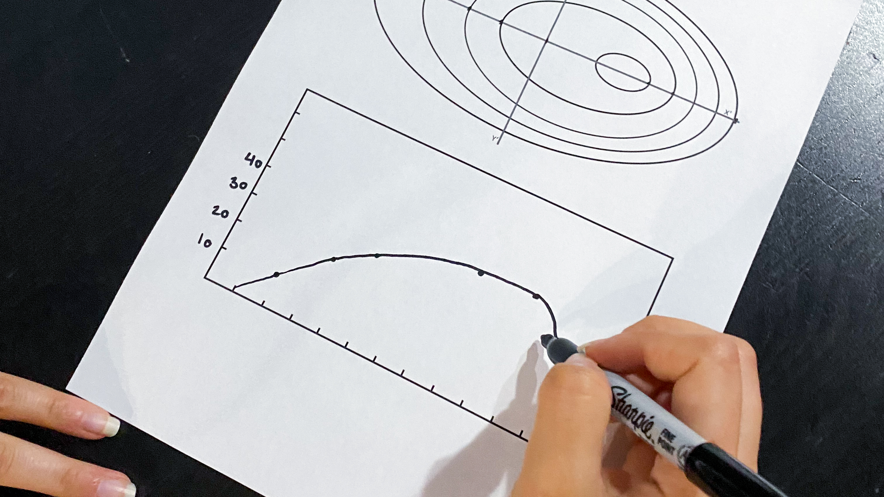
Step 8. Image credit: NASA/JPL-Caltech | + Expand image
- Have students complete the same profile for the Y-Y’ cross section using the same steps. Is the same information captured in this profile? Challenge students to explain why you might select one view over another and any drawbacks to those profiles.
- Have students complete the remaining two profiles on their data sheet and answer the questions about more complicated maps.
- Describe to students the differences between sonar, lidar, and laser altimetry as tools for building contour maps, per the background section above. Ask students to predict which technique they would use for each of the four maps and why.
Discussion
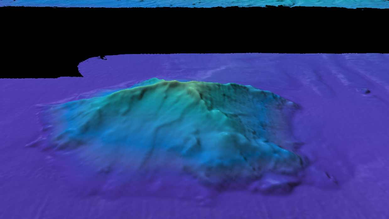
Sonar image of a seamount shown as a 3D elevation profile with no vertical exaggeration. Image credit: Ocean Exploration Trust | + Expand image
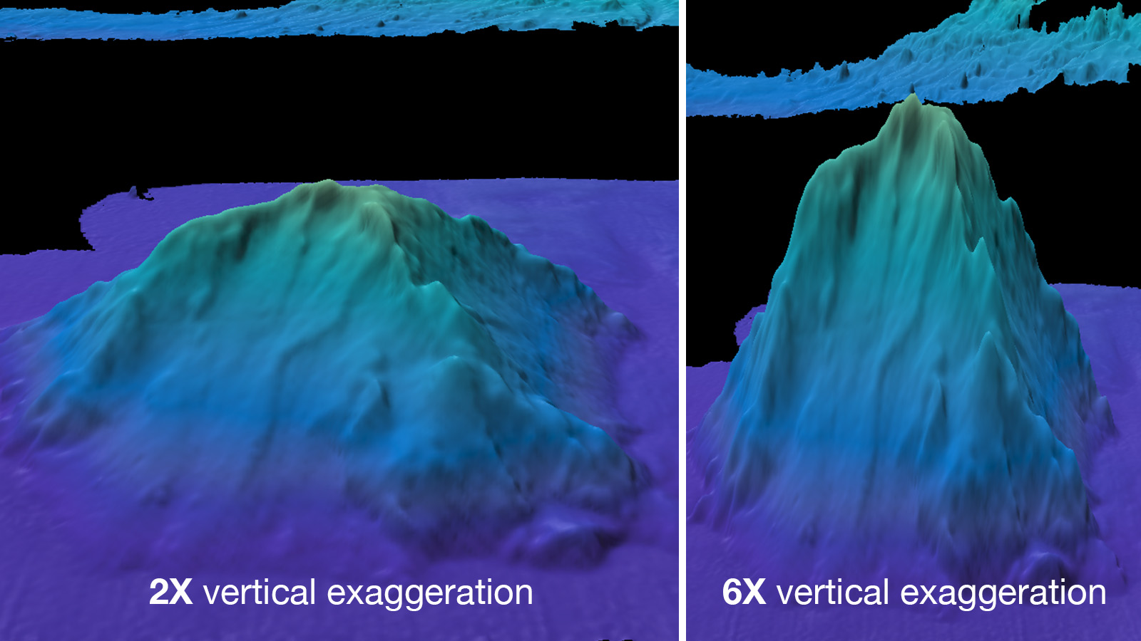
Sonar images of the same seamount shown with 2x and 6x vertical exaggeration. Image credit: Ocean Exploration Trust | + Expand image
- What surprises did you encounter as you plotted the values for your x versus y axes? How could you use a vertical exaggeration to better display certain features and why may this lead to misconceptions?
- What limits are there to using a cross section on a contour map, such as in the X-X’ or Y-Y’ cross sections?
- Which of the mapping technologies discussed would you use for each of the features? When one is more beneficial than the others, and what consequences come with that selection?
Assessment
- Students will be able to successfully construct an elevation profile of their geographic features from contour maps.
- Students will be able to select and defend the choice of several technologies (e.g., radar altimetry, sonar, or lidar) for mapping each feature.
Extensions
- Consider having students construct three-dimensional topographic/bathymetric models of their features with this additional lesson on mapping.
- Challenge students to plot the data points in spreadsheet software to create an elevation profile. They’ll need to determine which type of graph best displays the data (line), and may choose to display the data in a graph that highlights limitations of the data, such as a bar graph.
Explore More
-

How to Read a Heat Map
Students learn to read, interpret and compare “heat map” representations of Earth science data.
Subject Science
Grades 4-12
Time 30-60 mins
-

Coral Calculus: A 'Pi in the Sky' Math Challenge
In this illustrated math problem, students use pi to measure the water depth of an area mapped by the CORAL mission.
Subject Math
Grades 9-12
Time < 30 mins
-

Teaching Space With NASA – Robotic Oceanographers
Learn how we use robotic explorers to collect data on how our oceans are changing and explore ocean worlds beyond Earth.